
 Corporate DNA
It is essential to understand a company before you can give it a logo, a font, a colour – in short a uniform design. What does the company do? What can it do? What does it sell? All the employees embarked on a journey back to the past and into the future with the Berlin-based design agency DLC. Common goals were formulated, target markets were analysed, possible strategies were devised and developed, and various ideas were put forward along the way. Naturally, the aim was for the new corporate design to reflect the long history of the company without coming across as stale and outmoded. A “fresh start” for the company now in the capable hands of the third generation.
Showing the way
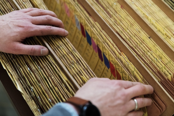
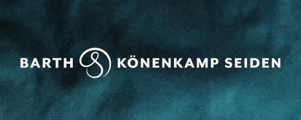
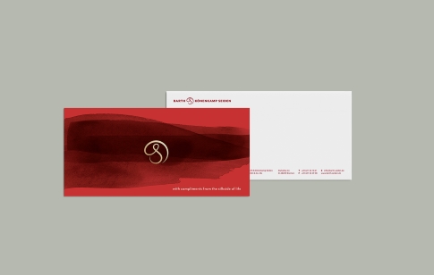
Although the company had never had a logo, there were still calls for a figurative mark. The Silk Mark – recognised as a universal symbol of the quality of silk – was taken as a basis for the development of a new word and design mark. The logo symbolises the origin of silk. It all began, and it still all begins, with one thread – the beginning of every yarn and every fabric. The figurative mark is a connecting element, forming part of the name and also standing alone.
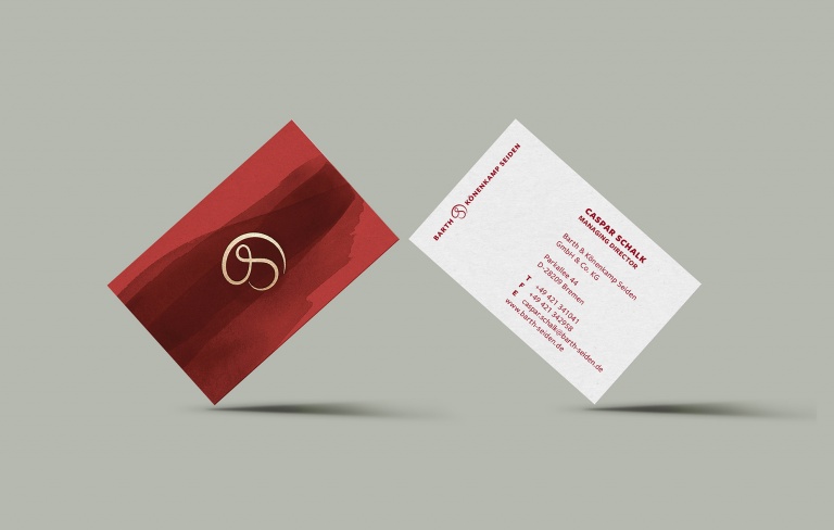
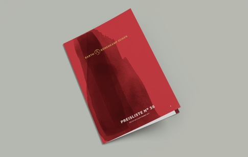
Due acknowledgement of the Hanseatic credentials and the associated merchant tradition was also included in the design brief. Red and gold – already familiar to customers and business partners as the signature colours – were to be retained and reflect the traditional Far Eastern character and the relations nurtured by Barth & Könenkamp with its producing countries. All revamped, however, and packaged in a new and contemporary wrapper.
![]()
A new broom sweeps clean
After a three-month design process, the new business stationery was brought out. The revised design was also incorporated in the recently revamped website, making its online appearance along with the presentation of the entire Barth & Könenkamp range in an extensive product catalogue.
Interesting stories, background information on the subject of silk and on the Bremen-based trading company are included for good measure and to arouse curiosity.
Tradition dating back to 1885 but now in a new guise!


